
Barry, thank you for giving me permission to review your church’s website. Happy to do it. I think I have a lot of value that I can bring to you.
Let’s talk about some of the good things first. It is good that when I resize your website, it automatically resizes things and re-lays them out so they are still readable. If I go all the way down to mobile size, a user on a smartphone is still going to be able to read your website and interact with it, which is great.
 Homepage
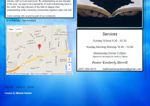
I would suggest a couple things. The part with the information about worship services needs to be moved up above the map (in mobile view) and the image (in desktop view). You certainly don’t want the map and the image to be the first things they see.
There are some layout issues in the worship services information box, so I would make sure this lays out properly for mobile users and for desktop users as well.
You want to link up your phone number and your email address so that any user can just click on those and make a phone call or send an email.
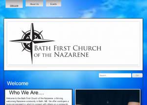
The logo is way too big. The text (on the logo) should be a web font so that it’s actually text on the page rather than being a graphic; that will help with search engine optimization (SEO).
 Welcome
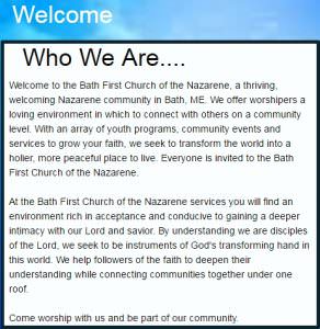
I love that you have a Welcome section here, but you then start talking about Who We Are. This should be all about welcoming the first-time guest, inviting them to worship with you … “Hey, if you’re looking for this … if you want this … if you, you, you.” It’s all about you, and not us and we. You have some statements like that in here, “Come worship with us.” “You will find an environment rich in acceptance and conducive to gaining a deeper intimacy.” That part is very church speak. I would just make it a lot friendlier, a lot less formal. You don’t need to be formal. What you’re trying to do is to start building a relationship with people. Your church website is your first opportunity to welcome people into the life and body of your church. In doing that, it’s all about building a relationship with them. So imagine you were sitting down with a friend, speaking about your church: What would you say to them? That’s what you want to put on your website.
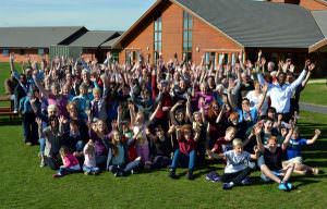
 The image you used on the homepage doesn’t really do anything for you. I suggest you replace this image with a photo from your church, such as a photo of your church worshipping. Also the size of the image is not right. It doesn’t lay out very well with the other elements on the page. If you can put a slider here so you have multiple photos, that would be great. Photos are going to help paint the picture of your church and who you are, and they give people a view of things very quickly. You can show the size of your church building, the size of your worship congregation, and the ethnic diversity or lack thereof, which may be important to someone either way. All those things can be communicated very easily without you having to ever say them on your website.
 About Us
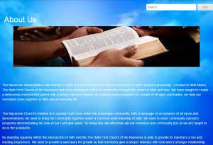
As for the About Us page, if there’s a way you can figure out a different name, that would be better.
Biggest problem on this page is that the background here goes very light and your text is white, so it’s almost impossible to read. Since this is basically pretty much unreadable text, so I would take care of that.
 Events
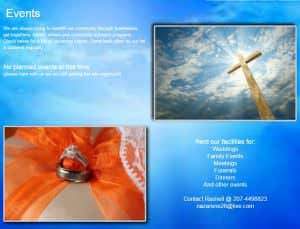
On your Events page, you need to remove the part that says, “No planned events at this time.” Telling people that you have no planned events broadcasts that you’re not really doing anything in your church. I think it’ll be better for this to be blank than to tell them that. Surely, you have something that’s going on. If you don’t, then that just means you need to have one that’s geared towards first-time guests, right? A monthly coffee with the pastor, or something like that. Then you can put that on the Events page.
I would also remove the part about renting your facilities because, in effect, you’re saying, “Hey, we don’t have any events for our members or guests, but if you want to rent our facilities, if you want to pay us money, then you can do that for these events.”
My question would be: How often does your space get rented? If this happens a lot, if people do seek out your church because it’s a great looking church building, then I’d put a picture of your church or your sanctuary, if people really like the sanctuary. But I would also move all of this information to a different page so that it’s separate. You can have a page on Facility Rental. If you can put it as a sub-menu, like under About Us and then have Facility Rental, then that would be even better so you’re not highlighting that as one of your main pages of the site. As an alternative, you can put in a custom photo that shows an event at your church.
 Header
There’s a lot of wasted space in the header on the homepage, like the space between the menu and logo, and between the logo and the content.
The menu items that drop down in a non-intuitive way — nobody really does menus like this on the Internet, so it looks odd to see one tab hanging down further than the others. It’s not really clear why they’re that way until you click on one of the other tabs and pay attention to what’s happening.
If the search bar was on the topmost part of the page, it would save you a lot of room. You don’t have to have so much white space below the header. The image of the logo should be much smaller. You can also add a tagline. When these elements move up the page, then you’ll have the Welcome starting more like in the middle of the screen, because there’s a lot of wasted space.
I think you should replace the header with a Welcome Center page or just have it all on the page where you tell people everything that they would want to know about your church worship times, photos, and other information.
 Footer
All of the information in the Services box should also be moved down into your footer, including the address of your church. When you do that, no matter what page the user is on in your website, they’re always going to see that information. This is great for search engine optimization.
If I’m just a casual user browsing your website, there’s no way I can tell where your church is actually located. If I look closely at the map, I can see, “Oh, it looks like they’re in the town of Bath.” But where is that? I have no idea. I’m from Texas, so none of this is familiar to me. If I read very closely, which most people don’t do, I can see that you are in Bath, Maine, and I think you mentioned that on your About Us page as well. It needs to be much clearer.
Those are the things I have for you that I think would be great enhancements to your website.
 Domain Name
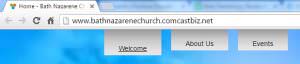
Your domain name is bathnazarenechurch.comcastbiz.net. This is not your own custom domain name, and you really must have your own. What happens in Google is first, Google uses your domain name as part of the keywords. So if your domain name was bathnazarenechurch.org, then having the word church in there is going to help you in terms of search engine optimization (SEO), in terms of showing your website in search results when someone searches for a church. For example, if someone was searching in Bath for a Nazarene church, you would have a very likely chance of coming up when that is your domain. You have that in your subdomain right now — the first part is called the subdomain, the last part (comcastbiz.net) is the domain name, which I’m assuming is your internet service provider. The problem with that is that Google keeps track of the history of your domain name. Since comcastbiz.net doesn’t belong to you guys, if you do ever change your website to your own custom domain name, you’re going to lose the history that Google has stored up for you in terms of that domain. This is why you want to set up your custom domain name at the beginning. You don’t want your domain to change when you switch web host providers or internet service providers. The domain name really needs to be taken care of; that is a critical issue in terms of your search engine optimization. That’s something we can help you resolve.
 Optimized Template
Here is a website template we have that would be similar to what you have today, but with all the current optimizations that I mentioned.
Homepage
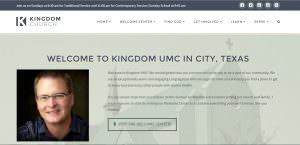
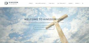
As you can tell, this website is all about welcoming the first-time guest. We have a welcome message addressing the first-time user. You can replace any of the elements, change up the website however you want. There’s a button on the homepage to Visit the Welcome Center, and that takes them into a dedicated area that addresses all of their needs. We start off with a great photo at the top of the Welcome Center page, which shows the church waving and welcoming people in, and additional photos throughout the page. It also includes Things You Want to Know and Why Belong to a Church. The next pages in the section include About Us, Times & Location, Meet the Pastor, Meet the Staff, Common Questions, and You are Invited.
 The photos on the homepage are completely customizable. You can put a photo of your church in the background so people will be able to visually identify it without just taking up a bunch of space on your website. If you have a really great photo of your pastor, that’s a good thing for them to see, along with a good quote from your pastor. We can also put the map on the webpage and include contact information to give the ability for the user to contact you, if they need something or have a problem.
 Footer
The white section and the section below it is your footer. It has your name, address information, phone number, fax number, and email address. Everything is linked up properly. It has your Sunday morning schedule. This is going to be the main entry point into your church. Not as important to describe, let’s say, your 5:00 p.m. Wednesday dinner, because first-time guests probably are not going to come to that as a first event. Unless you made it a bigger deal, like if you had a guest speaker or something like that, then you can promote that separately.
Mention all the cities around you. “We’re praying for all these people from these different cities and towns” is a search engine optimization technique. Then we have an area for them to subscribe to your newsletter, if you have one, which we can help you create if you are one of our clients. We also mention the worship schedule down at the bottom again, including links to different sections on the site.
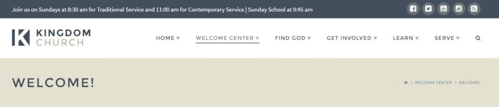
At the top, you have the Welcome Center menu, then you can lead people to Find God, tell them more about getting involved in your church and how they can actually become a disciple, jump into some classes, and finally how they can serve. We look at this as sort of a progression. You start off with the homepage, we’re going to welcome you, then we’re going to help you find God, you’re going to get involved in the church, you’re going to continue to be a disciple, you’re going to be discipled, and then eventually, serve the church again.
We also have ten different homepage options for this particular church website template, and everything that you see is completely customizable, even these different sections. If you don’t like a section, you can completely change it or remove it.
 This one has a lot more different sections on the homepage. We have the opening graphic, You’re Invited section, Get Involved, Get Connected, Help … any of these sections can be moved around and changed. Your logo can be put in there. You can see how the logo is very small. The menu here is compact.
 The search function actually brings up a full-page search; if I just press Escape, it gets us back to the homepage. Now we can do a full search, and it doesn’t take up any additional room on the webpage.
There are a lot of great features about this Kingdom website template, but those are some of the main ones. It’s very manageable. When you go in the Editor, all you do is click on the Welcome text on the homepage and you can just type in whatever you want. The same thing for each text, button, and other elements on the page, making it very easy to manage and customize.
Let me know if we can help you guys. We would love to build a new website for you and have it be something that’s really engaging to your first-time guests so that they would want to come and visit, find God, and become a disciple at your church.
God bless!
Summary
- Your website should be all about welcoming the first-time guest.
- It’s all about YOU (the visitor) and not us and we.
- Use everyday language, so you seem friendlier and less formal.
- Design your homepage so that it welcomes first-time guests.
- Include a photo of your church and a photo of your pastor with a quote from him or her.
- If you have an Events page, focus on events that are geared towards first-time guests.
- Register for a custom domain name.
- Create your menu and submenus so that there’s a natural progression.
- Design a clean, responsive layout.
- Make sure elements on the webpage are laid out for both desktop and mobile viewing.
- Minimize unnecessary white space.
- Use relevant images.
- Select font types, sizes, colors, and background colors so that they’re easy to read.
- Resize logo so it’s not imposing.
- Use text for your church name instead of a graphic to help with search engine optimization.
- Include all pertinent information in your footer.
- It should include your church name, address, contact numbers, email address, link to a map, and service times.
- Link up your contact numbers and email address.
- Mention the cities around your church. This is another search engine optimization technique.
My name is Patrick Steil, and I’m the owner of ChurchBuzz. My wife and I started ChurchBuzz about six years ago. We’ve actually been in business for ourselves more than 21 years now. We started ChurchBuzz with the idea of focusing on helping churches with the technology behind their websites. So that has doing into a whole lot of different things to help churches optimize their websites.
We have six children — six boys total. The oldest four are now in college or working, and our two youngest are 9 and 11. We knew that this was going to be a time in our lives when if we were going to make some big changes, it would be the time to do it. We initially talked about moving. Then we finally came up with this grand idea to spend a year on the road, traveling around in an RV, with the two young boys with us. So that’s what we’ve been doing since August 2015.
Once we really got serious about traveling in an RV, I had this idea: “Every Sunday we’re out, let’s go visit a new church and let’s be first-time visitors.” So we’ve been doing that. If you go to ChurchBuzz.org, you’ll see a bunch of blog posts and a couple of videos on our Facebook page. I hope to get all this material on our website and also on our YouTube channel as well.